How colour affects the perception of space in interiors
How light, dark, warm and cool colours change the size and proportions of a room, and how to choose a colour scheme for a small room, ceiling or north room.
 Ivan Dyulgerski, architectPublished Updated 5 min read
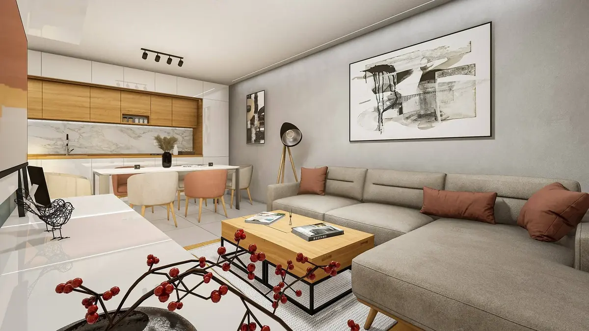
The same room can feel cramped and oppressive or bright and airy – without moving a single wall. Often the only difference is colour. Colour changes the way the eye judges distance, height and even the temperature of a room, which makes it one of the most powerful and least expensive tools in interior design.
Here we look at how light, dark, warm and cool shades affect the perception of space, what happens when you paint the ceiling or a single wall, and how to choose the colours for a particular room step by step.
How do colours change the perceived size of a room?
Light colours make a room look larger, while dark colours make it feel smaller and more intimate, because the eye reads reflected light as spaciousness. White, cream and pastel shades bounce back much of the light that falls on them, so the room looks brighter and more open. Dark surfaces absorb light, and the boundaries of the room seem to move closer.
The second key pairing is warm and cool. Warm colours – red, orange, yellow, terracotta – visually advance towards the viewer. Cool colours – blue, green, grey-blue – seem to recede. That is why a wall in a pale, cool shade can make a narrow room feel deeper, while a warm tone will draw together the walls of an overly large, empty room.
Saturation and contrast
Highly saturated colours attract attention and fill the space, while muted shades stay in the background. Strong contrast between walls, floor and furniture breaks a room into separate elements, whereas a calm, tonal palette unifies it and makes it look more coherent and larger.
Which colours make a small room look bigger?
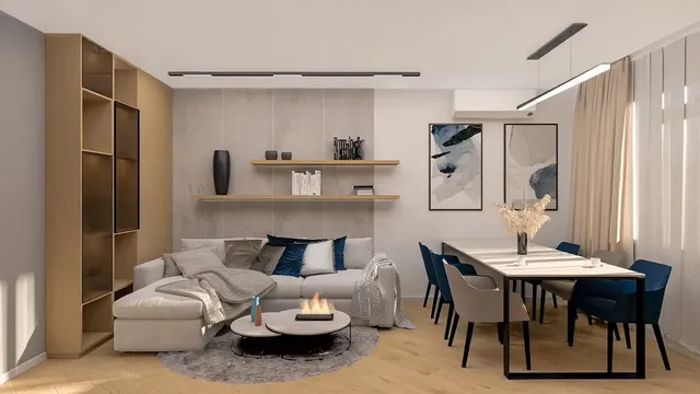
For a small room, the safest choice is light, slightly muted shades with little contrast between the walls, doors and ceiling. That does not necessarily mean white everywhere – warm white, pale greige, misty green or pale blue work just as well and feel cosier.
- Light walls and ceiling in one tone – the edges of the room blur and it looks taller.
- Furniture in the wall colour – built-in wardrobes painted like the wall all but disappear.
- A light floor – reflects light up towards the ceiling and adds a sense of air.
- Only a few accents – one or two saturated details bring the room to life without overloading it.
- Mirrors and glossy surfaces – multiply the light, especially opposite a window.
This is particularly useful in Bulgaria's typical prefabricated panel-block apartments, where rooms are often small and corridors narrow and without natural light.
When are dark colours a good idea?
Dark colours are a good idea when you want cosiness, depth and drama, and the room either has enough light or does not need to look large. A bedroom, study, library or dining room often benefits from navy, olive, graphite or chocolate brown.
Pros and cons of dark walls
- Pro: they create an intimate, calm atmosphere suited to rest.
- Pro: in a dark room the corners disappear and the boundaries become indistinct – paradoxically, this can add depth.
- Pro: light furniture, artwork and plants stand out vividly against a dark background.
- Con: they absorb light, so artificial lighting needs to be planned more carefully.
- Con: in a small room with a small window they can feel heavy and oppressive.
- Con: dust and scratches show more on matt dark paint.
A good compromise is to paint just one wall dark – the one behind the bed or sofa – and keep the rest light.
How do the ceiling, floor and individual walls change proportions?
By distributing colour carefully across the surfaces, you can visually raise, lower, lengthen or shorten a room.
Low ceiling
Paint the ceiling lighter than the walls or in the same pale tone. The upper boundary then blurs and the room looks taller.
Excessively high ceiling
In old houses and buildings with high ceilings, a darker or warmer ceiling brings the height down and makes the room cosier. Painting the walls only up to a certain height achieves the same effect.
Long, narrow corridor
A darker or warmer end wall visually shortens the corridor, while light side walls widen it.
Feature wall
A single wall in a different colour directs the eye and defines the room's focal point. If it is cool and light, it appears further away; if it is warm and saturated, it appears closer.
How does light change the colour of walls?
The same colour looks different depending on the orientation of the windows and the type of artificial lighting, so a sample should always be checked in situ.
- North-facing rooms receive cooler, diffused light – cool greys and blues look even colder there. Warm whites and beiges compensate.
- South-facing rooms are bathed in warm light for most of the day and cope well with cooler shades too.
- East- and west-facing rooms change dramatically through the day – in the morning or afternoon the colour can look entirely different.
- Artificial light has a colour as well: warm white light warms the walls, while cool light makes them bluer and greyer.
How do you choose colours for a room step by step?
It is easiest to start from the room's function and light rather than from a sample card in the shop.
- Decide what feeling you want – spaciousness, cosiness, concentration or energy.
- Check the light – window orientation, shading and how the room will be used in the evening.
- Choose a neutral base colour for the walls and ceiling, which will cover the largest area.
- Add a second, complementary colour for furniture, textiles or one wall.
- Plan a small amount of accent colour – the 60–30–10 ratio between main, secondary and accent colours is often used.
- Test on the wall – paint large samples and observe them in the morning, afternoon and evening.
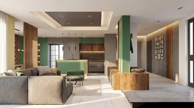
- Consider adjoining rooms – in an open-plan layout, the colours need to speak to one another.
Our approach at DARCH Projects
In our studio's interior design work, the colour scheme is decided alongside the layout, materials and lighting, not at the end. Through photorealistic 3D visualisations, you can see the room in several colour options and under different light before you buy the first tin of paint.
Frequently asked questions
What colour should I paint a small room to make it look bigger?
Choose a light, slightly muted shade – warm white, pale greige, soft green or pale blue – and use it on both the walls and the ceiling. Reduce the contrast between walls, doors and built-in cupboards so that the boundaries blur. Keep saturated colours for one or two small accents, and add a mirror opposite the window for more light.
Do dark walls make a room look smaller?
Usually yes, because they absorb light and visually bring the walls closer. In a well-lit room, however, a dark colour can blur the corners and add depth and cosiness. It suits a bedroom, study or dining room. If the room is small with a small window, it is safer to use the dark colour on one wall only.
What colour should a low ceiling be?
A low ceiling works best when it is lighter than the walls or in the same pale tone as them. The upper boundary of the room then blurs and the room looks taller. Avoid a dark ceiling and strong contrast along the line where wall meets ceiling, as both emphasise the limited height.
Which colours suit a north-facing room?
North-facing rooms receive cooler, diffused light in which greys and blues look even colder. Warm shades therefore work better – cream, warm white, beige, pale ochre or muted pink. Check the sample in situ at different times of day, because a colour can look quite different in the shop and at home.
Want this for your home?
We will talk through what suits your property, budget and way of life.