Colour psychology: how colour at home affects your mood
What each colour suggests, why saturation and light matter as much as hue, which colours suit each room and how to test a shade at home before committing.
 Ivan Dyulgerski, architectPublished Updated 5 min read
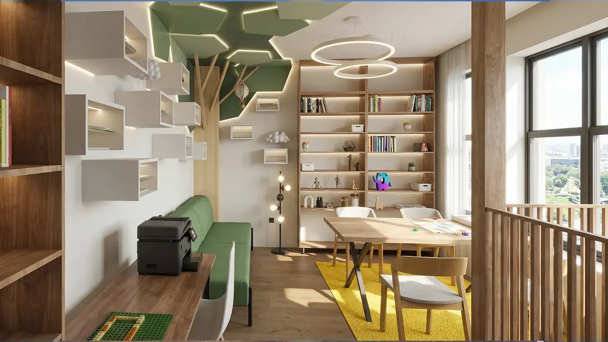
We walk into a room and decide within a second whether we like being there – often before we have even noticed the furniture. Much of that first impression comes from colour. That is why colour matters so much in interior design: it works quietly, but constantly.
In this article we look at what the main colours suggest, which factors change their effect and how to use this knowledge when choosing colours for your own home – without falling into clichés.
What is colour psychology?
Colour psychology is a field that studies how colours influence our emotions, perception and behaviour. In interior design it is used to set the atmosphere of each room – calmer, more energetic or more focused.
An important caveat: reactions to colour are not universal. They depend on personal experience, culture, context and the specific shade. The associations below are therefore widely shared guidelines, not an exact science that guarantees a particular effect.
What does each colour suggest?
The broadest division is between warm and cool colours: warm ones (red, orange, yellow) appear closer and more active, cool ones (blue, green, violet) further away and calmer.
Red – energy and sociability
Red is associated with passion, energy and activity. In large quantities it can feel overbearing, so at home it works best as an accent in the dining room, in textiles or on a single piece of furniture. Muted versions – burgundy, terracotta, brick red – are far easier to live with.
Blue – calm and distance
Blue is perceived as calm, clean and stable, which is why it is a frequent choice for bedrooms and bathrooms. In rooms with little light, however, saturated blue can turn cold; grey-blues and dusty shades work better there.
Green – balance and nature
Green is the colour that most strongly reminds us of nature, and it is therefore considered one of the most versatile choices. It suits living rooms, studies and bedrooms. Olive and sage look good with wood, while deep forest green creates a sense of cosiness and depth.
Yellow – light and optimism
Yellow brings a feeling of sunshine and cheerfulness. It is particularly useful in dark hallways, kitchens and rooms without natural light. In a bright version, however, it quickly becomes tiring, so soft, creamy or ochre shades are preferred for walls.
Grey – neutrality and backdrop
Grey is a calm backdrop that lets other colours and materials stand out. Warm grey with a beige undertone is cosy, while cool grey looks modern but, in large amounts, can make a home feel impersonal.
White and beige – light and space
White and beige tones reflect the most light and visually enlarge a room. Choosing the right undertone is important: warm white is welcoming, whereas a completely pure white can sometimes look like a hospital ward.
Which matters more: hue or saturation?
Saturation and lightness often affect the atmosphere more than the hue itself. Dusty blue and neon blue sit in the same place on the colour wheel, yet they create entirely different impressions.
- Saturated colours – energetic and dramatic, suited to small areas and accents.
- Muted colours (with grey added) – calm and refined, easy to live with on large walls.
- Light tones – expand the space and reflect light.
- Dark tones – create intimacy and cosiness, but need good lighting.
So rather than asking “blue or green?”, it is more useful to ask “how dark and how saturated?”.
How do materials and light change the effect of colour?
The same colour behaves differently depending on the surface it is applied to and the light that falls on it. A colour decision should therefore never be made in isolation from the materials.
Texture and sheen
Matt paint absorbs light and makes colour softer and deeper. Gloss reflects light and intensifies saturation, but it highlights every imperfection in the wall. Lime and decorative plasters add a subtle play of shadow, thanks to which even grey looks alive.
Natural materials
Wood, stone, linen and wool have colours of their own and “warm up” any palette. A cool grey room with an oak floor and linen curtains feels completely different from the same room with glossy tiles and chrome.
Light through the day
Daylight shifts from cool in the morning to warm in the evening, and artificial lighting has its own colour temperature. Warm light intensifies yellows and reds and mutes blue; neutral light shows colours more faithfully. It is best to choose the lighting together with the paint, not after it.
Which colour to choose for each room
Start from what you do in the room and how much light it receives.
- Bedroom – muted blue, green, warm grey, ash pink. The aim is relaxation.
- Living room – warm neutral bases with earthy accents; a place for socialising but also for rest.
- Kitchen and dining room – warm accents such as terracotta, mustard or red in small amounts.
- Home office – green and calm neutral tones that do not distract.
- Children’s room – cheerful colours as accents on a calm base, so there is room for sleep too.
- Bathroom – light, cool tones for freshness, or dark shades for a spa-like feel.
How to check whether a colour will suit you
The surest way is to live with a large sample on the wall for a few days.
- Choose two or three candidates in a similar shade, not ten different colours.
- Paint samples at least the size of an A3 sheet, or use large painted boards.
- Place them on different walls – next to the window and in the darkest corner.
- Observe them in the morning, in the afternoon and in the evening under artificial light.
- Notice how you feel, not only how it looks – after a few days the preference is usually clear.
How we approach it at DARCH Projects
When we develop an interior design project, we start with how you want to feel in each room, and the colours come afterwards. In photorealistic 3D visualisations you can compare several colour options side by side, in the real light of your home.
Frequently asked questions
What is the most calming colour for a bedroom?
Muted cool and neutral tones are most often recommended for bedrooms – grey-blue, soft green, sage, warm grey or ash pink. More important than the colour itself is that it is not bright or highly saturated. Test a sample under evening lighting, because that is when you spend the most time in the room.
Is it true that colours affect mood?
Colours affect how we perceive a space – whether a room feels warm, cold, spacious or cosy. Specific emotional effects, however, are not the same for everyone and depend on culture, personal experience, the shade and the light. It is best to use the general associations as a guide and make the final decision after testing on site.
What colour suits a kitchen?
Warm colours or accents are often chosen for kitchens – terracotta, mustard, warm white, or green combined with wood – because they create a welcoming atmosphere for eating and gathering. Practical considerations matter too: light cabinet fronts show less dust, while dark ones show fewer marks from everyday use.
Which colours should I avoid in a small room?
You do not need to avoid colours so much as use them in measured doses. Very saturated, bright tones on every wall make a small room feel overbearing. Dark colours can work well on a single wall with good lighting. A strong contrast between dark walls and a light ceiling, on the other hand, visually lowers the room.
Want this for your home?
We will talk through what suits your property, budget and way of life.