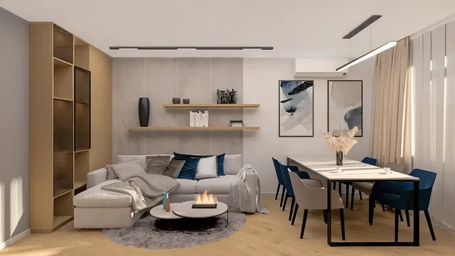
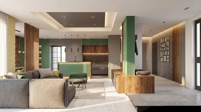
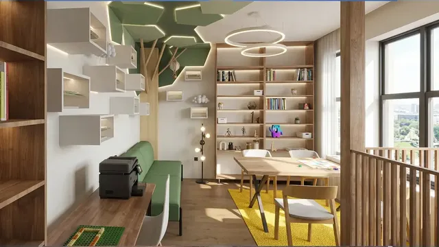
Colour schemes for your home: how to choose colours that work together
How to choose a colour scheme for your home: the 60-30-10 rule, the colour wheel, how light changes colour, and what works in each room.
 Ivan Dyulgerski, architectPublished Updated 5 min read
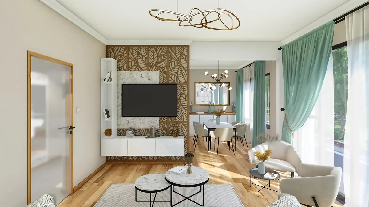
Colour is the cheapest and at the same time one of the most powerful tools in interior design. A single tin of paint can make a room feel taller, warmer or calmer – or ruin it. That is why choosing a colour scheme deserves more than a few minutes in front of a shop catalogue.
Here you will find the principles interior designers use to select colours, how to use the colour wheel, why light changes everything and what works well in the different rooms of a typical Bulgarian flat or house.
What is a colour scheme and why do you need one?
A colour scheme is a pre-selected set of colours repeated across walls, floors, furniture and textiles so that the home reads as a single whole. Without one, each room is furnished separately and the result is often busy and tiring.
A scheme does not mean every room has to look the same. It is enough for them to share a common base – for example the same warm white or beige – and differ in their accents. That way the feeling stays consistent as you move from the living room to the hallway and kitchen.
How do you choose a colour scheme, step by step?
Start with the purpose of the room and with the things that are not easily changed – the floor, window frames, kitchen worktop and large furniture.
- Define the mood. A bedroom usually calls for calm, a kitchen and dining room for energy and conversation, a home office for concentration.
- Look at the “fixed” elements. The parquet, tiles and window frames already have a colour and an undertone. The scheme should start from them, not fight them.
- Choose a main neutral tone. White, warm grey, beige or “greige” – it will cover the largest area.
- Add a complementary colour. A more saturated tone for furniture, the wall behind the bed, kitchen fronts or curtains.
- Decide on the accent. Small amounts of strong colour – cushions, artwork, a lamp, ceramics.
- Test in place. Paint a large sample on the wall and look at it in the morning, afternoon and evening. A small catalogue card is almost always misleading.
The 60-30-10 rule
This classic design ratio gives around 60% of the area to the main colour, 30% to the complementary colour and 10% to the accent. It is not a law but a starting point that helps you avoid a room in which every colour is shouting at once.
How do you use the colour wheel?
The colour wheel shows how colours relate to one another and suggests which combinations are naturally harmonious. Three schemes are used most often in interiors:
- Monochromatic – different shades of one colour, for example from light sand to dark brown. Calm and elegant, but it needs a variety of textures so it doesn’t become dull.
- Analogous – neighbouring colours on the wheel, for example green, teal and blue. Harmonious and natural, good for bedrooms and living rooms.
- Complementary (contrasting) – opposite colours, for example blue and orange. Dynamic and memorable; it works best when one colour dominates and the other is only an accent.
Triadic schemes with three evenly spaced colours also exist, but they are hard to balance in homes and require experience.
Why does light change colours?
The same colour looks different in rooms facing different directions, because natural and artificial light vary in temperature and intensity.
- North-facing – the light is cooler and more even. Cool greys and blues can look cold here; warmer neutral shades compensate.
- South-facing – plenty of warm light. You can afford cooler and darker colours without the room becoming gloomy. Bear in mind that strong summer sun bleaches saturated tones, so also check how fade-resistant the paint is.
- East and west – the light changes a great deal during the day, so test the sample at different times.
- Evening lighting – warm lamplight makes colours look more yellow, while cool light makes them bluer and sometimes lifeless.
Many Bulgarian apartment blocks, whether built from prefabricated panels or brick, have smaller windows and deep rooms. There, lighter walls and ceilings help the light reach further in, and dark colours are best kept for a feature wall or furniture.
Which colours should you choose for each room?
There is no single right answer, but some approaches work reliably.
Living room
Warm neutral bases with accents in earthy tones – terracotta, mustard, olive – create a cosy place to gather. If the living room is open to the kitchen, use the same base in both zones.
Kitchen
Contrast between light and dark surfaces – for example white walls and dark fronts, or the other way round – looks contemporary and is forgiving of everyday marks. Wood softens strict black-and-white combinations. If you want a bolder colour, put it on the base units or an island, so the upper part stays light and the kitchen does not look heavy.
Hallway and entrance
These are often the darkest spaces in the home, with no window of their own. A light, warm tone and well-chosen lighting make them more welcoming, and washable paint is a practical choice where the walls are touched most often.
Bedroom
Muted, less saturated colours: pastel blue, dusty pink, soft green, warm grey. The wall behind the bed is a natural place for a darker or more saturated tone.
Children’s room
Bright colours are appropriate, but it is better to use them on furniture, textiles and one wall and keep the rest calm. Children grow, and repainting one wall is much easier than redoing the whole room.
What are the most common mistakes?
- Choosing a colour from a small swatch or a photo online.
- Too many strong colours with no calm base.
- Ignoring the undertone – a warm beige next to a cool grey floor almost always looks “dirty”.
- White walls and ceilings everywhere “just in case”, leaving the home without character.
- Painting before the floor and main furniture have been chosen.
How we approach it at DARCH Projects
In our interior design work, the colour scheme is part of the overall concept, together with materials and lighting. Before the renovation we present different options in photorealistic 3D visualisations, so you can see how the room looks in its real light, not just on a swatch.
Frequently asked questions
How do I choose wall colours for my flat?
Start with the floor, window frames and large furniture, because they are not easily changed. Choose one main neutral tone for the largest area, one complementary colour and an accent in small amounts. Paint a large sample on the wall and observe it in the morning and evening before buying the full quantity of paint.
What is the 60-30-10 rule in interior design?
It is a design ratio in which around 60% of a room is in a main colour, usually a neutral, 30% in a complementary colour for furniture or textiles, and 10% in an accent colour for details. It is not compulsory, but it helps create a balanced space without a chaos of competing colours.
Which colours suit a north-facing room?
In north-facing rooms the light is cooler, so warm neutral tones usually work better – cream, warm beige, warm grey or muted earthy colours. Cool greys and blues can look gloomy there. Always test a sample in place, because colour reflected from surrounding buildings also has an effect on how the walls appear.
Which colours make a small room look bigger?
Light tones on walls and ceilings reflect more light and visually push the surfaces back. The effect is even stronger when the walls, skirting boards and even the doors are in a similar shade, because the boundaries blur. A dark colour on one wall can also add depth, provided the other surfaces are light.
Want this for your home?
We will talk through what suits your property, budget and way of life.