How to combine neutral and bright colours in interior design
How to pair neutral and bright colours at home: choosing the right neutral base, how much colour is enough, combinations that work and room-by-room advice.
 Ivan Dyulgerski, architectPublished Updated 5 min read
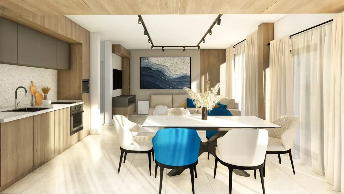
An all-neutral interior is calm, but it can also feel impersonal. An all-colour one is bold, but quickly becomes tiring. The real magic usually happens in between – when a calm neutral base meets one or two well-chosen bright colours. The home gains character without losing its harmony.
In this article you will see how to choose the right neutral base, how much bright colour is “enough”, which combinations almost always work and how to apply them in different rooms.
Why do neutral and bright colours work well together?
Neutral colours give the eye a rest, while bright ones give it somewhere to settle; together they create rhythm and balance. White, grey, beige, sand, graphite and black do not compete with each other, and they let a saturated colour stand out clearly instead of getting lost against a busy background.
There is a practical benefit too. Neutral walls, floors and large pieces of furniture stay current for years, while the bright elements – cushions, chairs, artwork, lamps – are easy and relatively inexpensive to change. That way an interior can shift with the seasons or your mood, without any building work.
How to choose the neutral base
Choose the neutral according to the light in the room and the bright colours you have in mind – its undertone matters most.
Warm neutrals
Cream, sand, beige, warm grey (so-called “greige”) and light wood. They make rooms feel cosy and are a good choice for north-facing rooms. They pair naturally with terracotta, mustard, ochre, brick red and olive green.
Cool neutrals
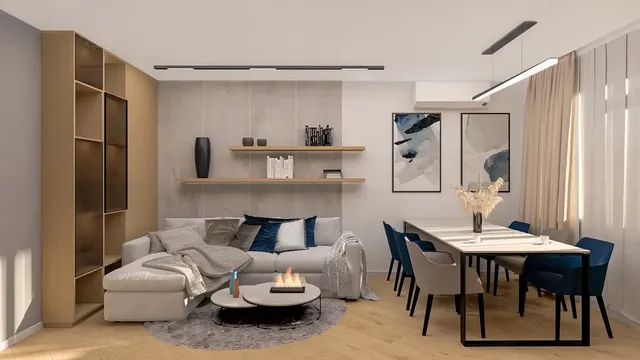
Pure white, light and mid grey, grey-blue and concrete. They look fresh and modern, especially in sunny south-facing rooms. They go well with cobalt blue, emerald green, turquoise and cool pink.
How to recognise the undertone
Place the sample next to a sheet of pure white paper. If it looks yellowish, pinkish or brownish, the undertone is warm; if it looks bluish or greenish, it is cool. The same applies to wooden floors and furniture, which are also part of the neutral base.
How much bright colour is “enough”?
As a guide, bright colours should take up around one tenth of the visible area of a room, with neutrals making up most of the rest. That is the essence of the popular 60–30–10 rule: 60% main colour (walls, floor, large furniture), 30% secondary colour (curtains, rug, smaller furniture) and 10% accent (cushions, accessories, art).
The rule is not a law but a starting point. In a small room it makes sense to use even smaller doses of bright colour; in a large, light living room you can afford a coloured sofa or an entire wall. Ideally there should be no more than two bright colours, and the accent should repeat at least two or three times in the room – in a painting, a cushion and a vase, for example – so that it reads as a considered choice rather than an accident.
Which neutral and bright combinations almost always work?
The safest combinations are those in which the bright colour and the neutral base share the same undertone.
- Warm white + terracotta – a Mediterranean, sunny and cosy feel.
- Light grey + mustard – a classic, easy combination for a living room or study.
- Pure white + cobalt blue – fresh and crisp, well suited to kitchens and bathrooms.
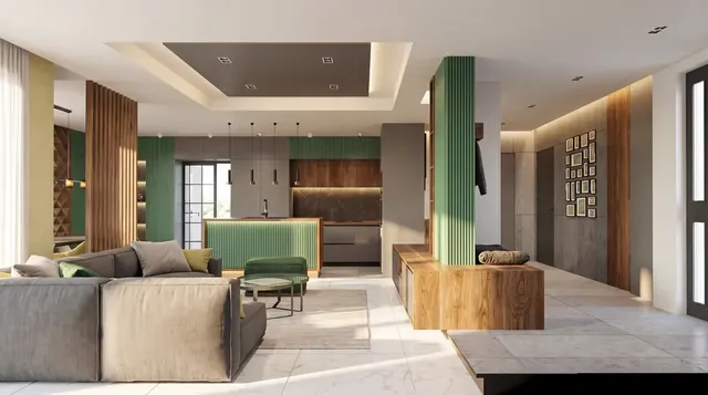
- Greige + emerald green – elegant and calm, lovely with brass and wood.
- Sandy beige + olive green – a natural palette for bedrooms and living rooms.
- Black and white + red – a graphic, bold combination; it needs very small doses of red.
- Concrete + orange – industrial character with energy, suited to a loft or office.
How to apply the combination in different rooms
Each room has a different function, so the bright colour goes in a different place.
Living room
Neutral walls and floor, with the colour in the sofa, an armchair, the rug or a single accent wall behind the television or bookcase. Plants add a natural green that goes with almost any neutral palette.
Kitchen
Coloured cabinets are a bold but increasingly common choice. If they are bright, keep the worktop, walls and floor calm. A more cautious option is to put the colour only on the base units or on the splashback between the cabinets.
Bedroom
Here bright colours are better toned down. Bed linen, curtains or an upholstered headboard in a rich but restful colour – deep green, dusty pink, ochre – create cosiness without disturbing sleep.
Bathroom
Coloured tiles in just one zone – behind the basin or in the shower – bring a small room to life, while the remaining neutral surfaces keep it light and clean.
Children’s room
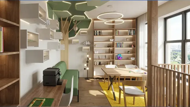
The temptation to use lots of colours is strong, but a calm base lets the bright toys, books and drawings become the accent. That way the room can “grow up” with the child.
How to combine the colours, step by step
The best results come when colours are chosen in a set order – from the largest area to the smallest.
- Define the neutral base – the walls, floor and large furniture you already have or are planning.
- Check the undertone – warm or cool, and whether it suits the light in the room.
- Choose one bright colour, and if you wish a second one that is either close to it or contrasting.
- Decide where the colour’s “weight” will sit – in furniture, on a wall or in textiles.
- Repeat the accent in two or three smaller elements around the room.
- Add texture – wood, linen, ceramics, metal – so that the neutral base does not look flat.
- Test with samples and fabrics on site, in daylight and in the evening.
Common mistakes
- Too many bright colours of equal strength competing with each other.
- Cool grey combined with warm accents, with nothing to link them.
- A single coloured object that looks “lost” in the room.
- Entirely smooth neutral surfaces with no texture or depth.
How we approach it at DARCH Projects
In our interior design work we start from the neutral base – the materials, floors and built-in furniture that will stay for many years – and only then add colour. With 3D visualisations we show several colour options for the same room so that you can choose with confidence, and you can browse finished examples in our portfolio.
Frequently asked questions
Which bright colours go with grey walls?
Light and mid-grey walls pair beautifully with mustard, yellow, cobalt blue, emerald green, turquoise and coral. If the grey has a cool, bluish undertone, cool accents such as blue and green work better. With warm grey, known as greige, terracotta, ochre and olive green are more suitable. One or two accent colours are quite enough.
What is the 60–30–10 rule in interior design?
It is a guide for distributing colour within a room. Around 60% of the visible area is the main colour, usually a neutral, on the walls, floor and large furniture. Around 30% is a secondary colour in curtains, a rug or smaller furniture. Around 10% is the accent – a bright colour in accessories, art and textiles. The rule helps a room feel balanced.
Can a kitchen have brightly coloured cabinets?
Yes – coloured kitchen cabinets are a popular choice with a lot of character. To keep the interior from feeling heavy, keep the worktop, walls and floor in neutral tones and choose a single bright colour. A more cautious option is to use the colour only on the base units or the kitchen island, with the wall units matching the wall colour.
How many bright colours should a room have?
In most cases one or two bright colours are quite enough against a neutral base. More colours of equal saturation start to compete and make the room feel noisy. If you want more variety, use different shades of the same colour, or add texture rather than new colours.
Want this for your home?
We will talk through what suits your property, budget and way of life.